SiteLink Grid
Website Grid
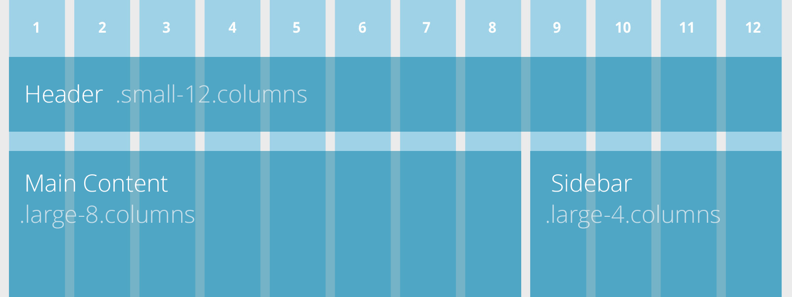
The SiteLink website is built on a 12-column flexible grid that can scale out to an arbitrary size that's also easily nested, so you can build out complicated layouts without creating a lot of custom elements. And when the Grid isn't enough for your site, it just gets out of the way.
Grid Benefits
Create powerful multi-device layouts quickly and easily with the default 12-column, nest-able Foundation grid. If you're familiar with grid systems, you'll feel right at home. If not, you'll learn quickly.
To learn more about the capabilties of the Grid and advanced layouts check out the ZURB Foundation who built the framework.